Motorola Solutions
Year 2021-2024
Software Adobe Photoshop
Adobe InDesign
Adobe Illustrator
Adobe Dreamweaver
Adobe XD
Adobe After Effects
Adobe Premiere
Categories Global Branding
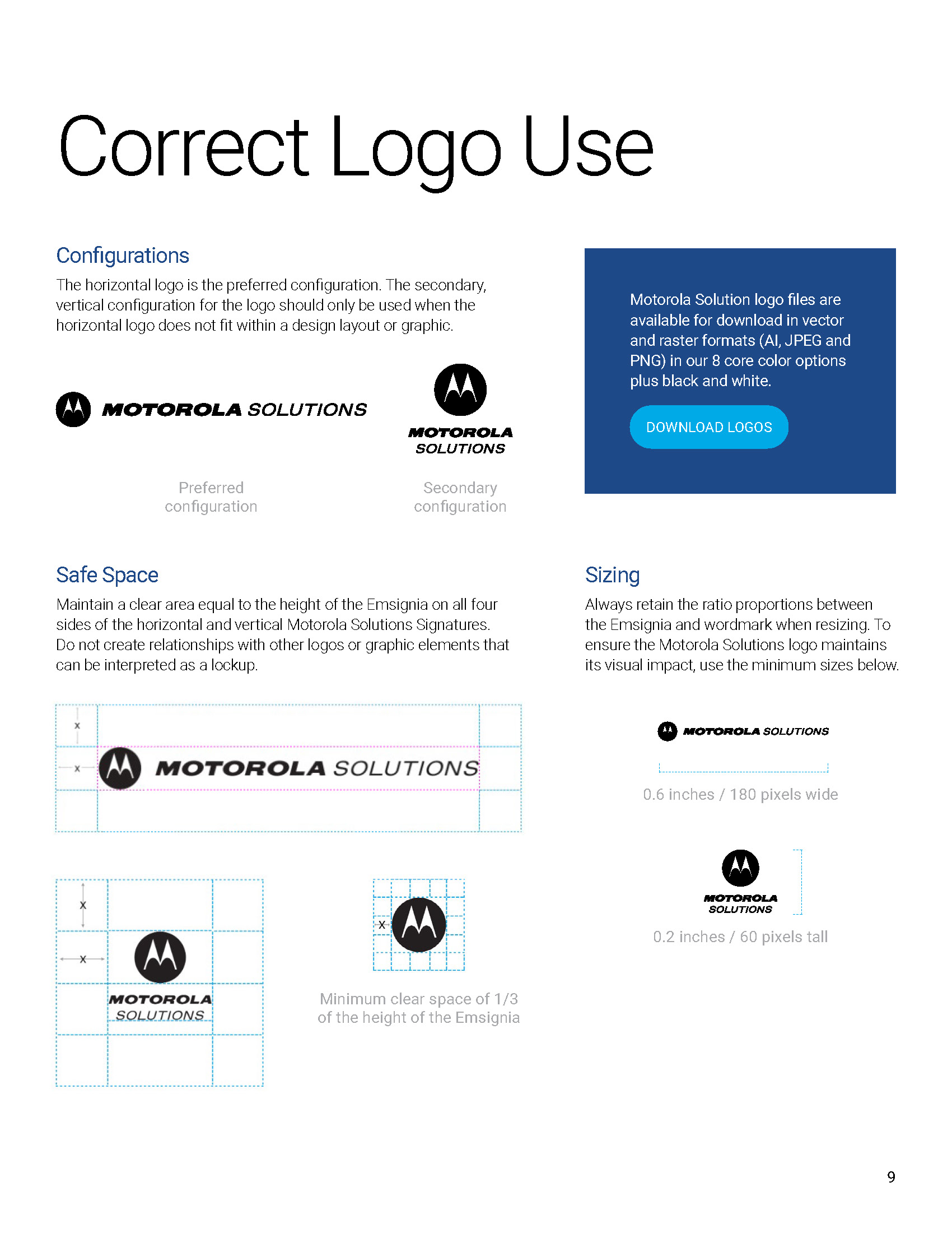
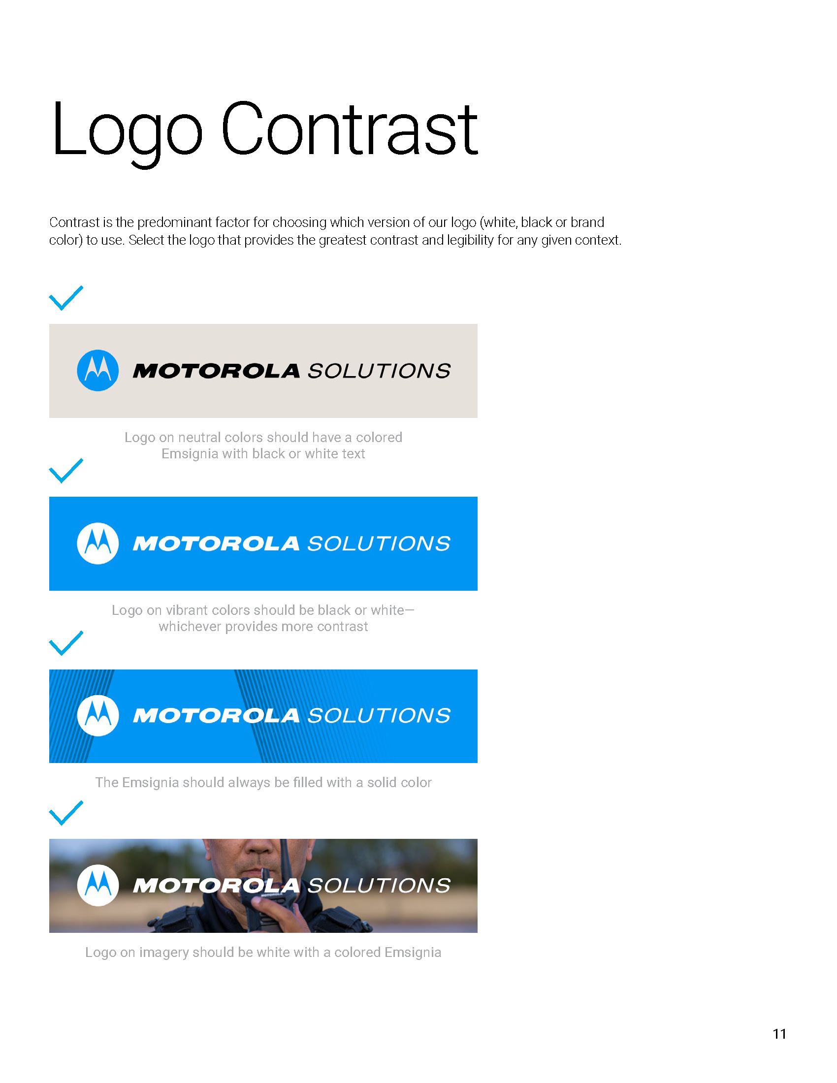
Guidelines
Marketing Campaign
Summit
Production
Brand Toolkit & Marketing Campaign

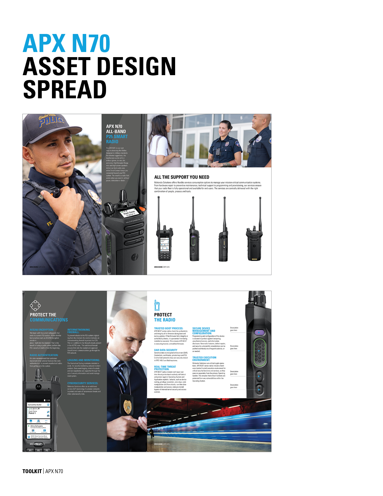
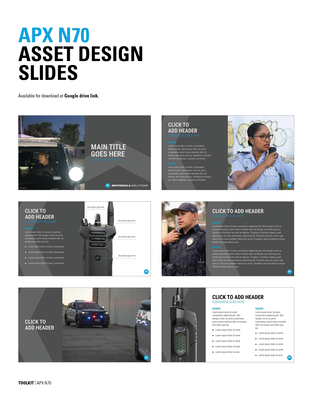
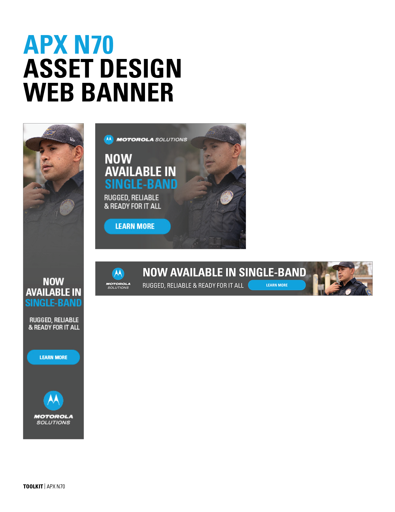
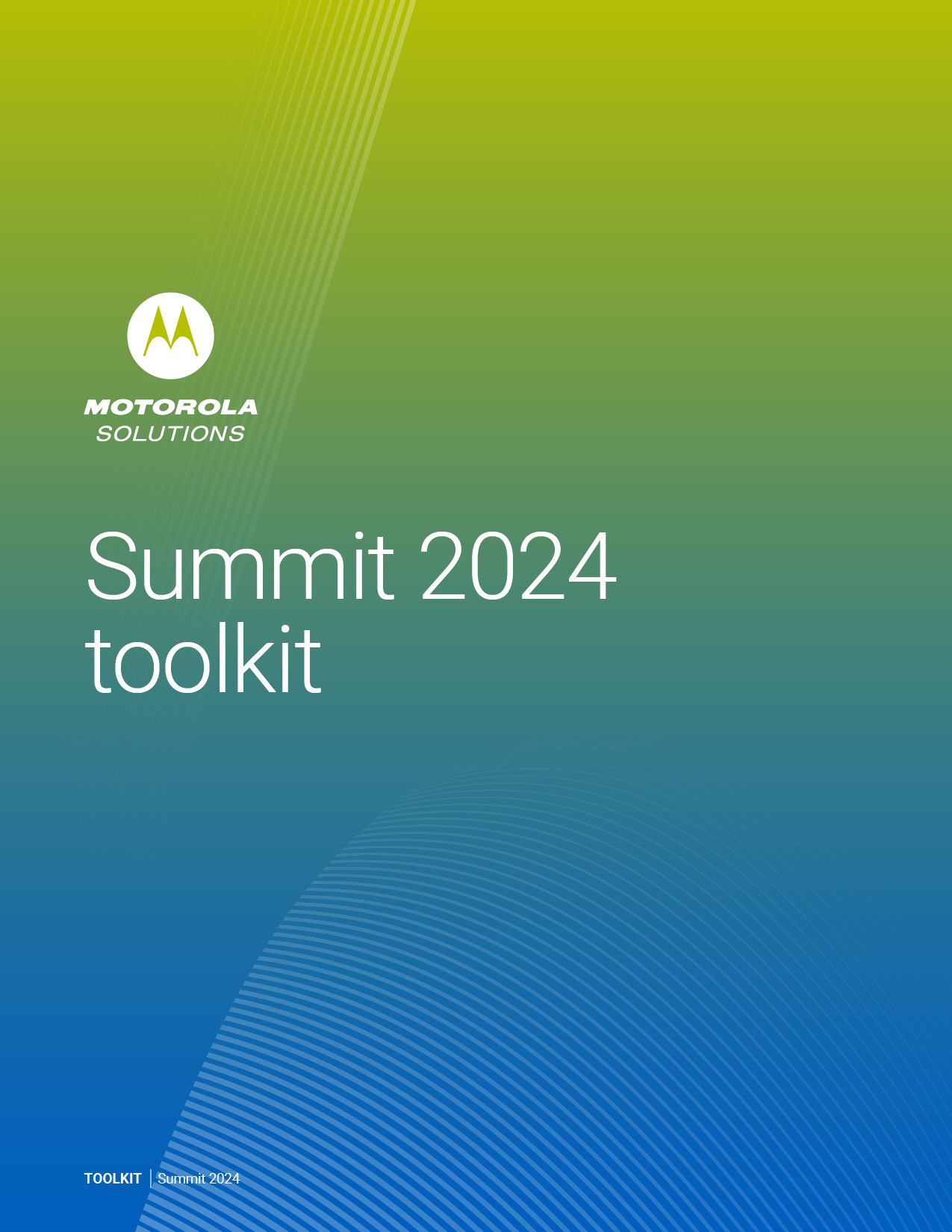
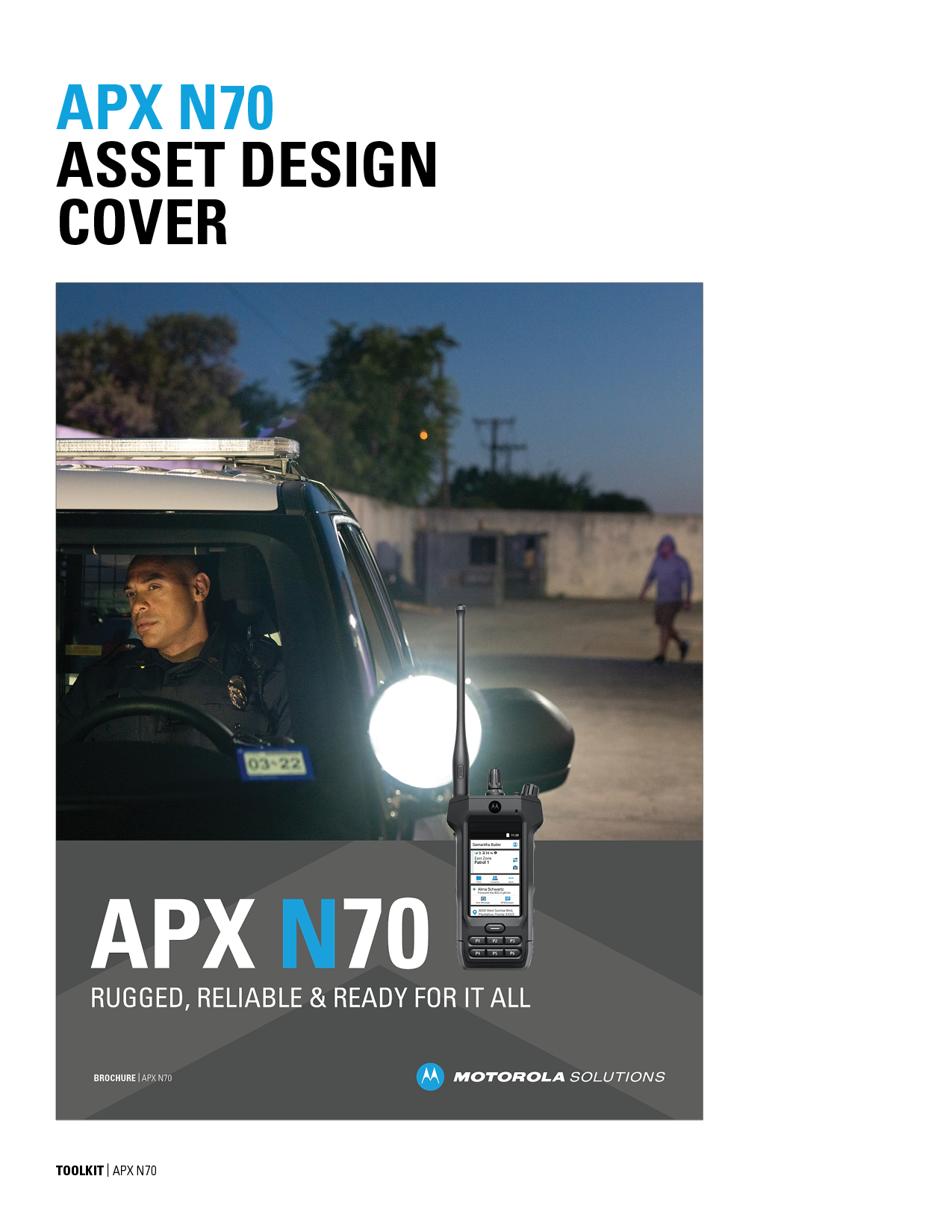
As the creative manager and designer, I developed the comprehensive brand toolkit for the launch of the N70, N50, and N30 radios—three products that marked a significant expansion in the brand’s radio lineup. This toolkit was created to ensure visual cohesion and consistency across all marketing, digital, and physical brand touchpoints. It was designed with scalability and adaptability in mind, supporting everything from high-level brand campaigns to detailed product-specific communications.

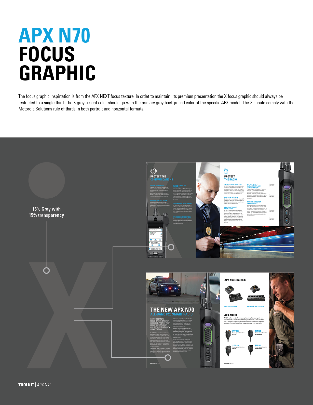
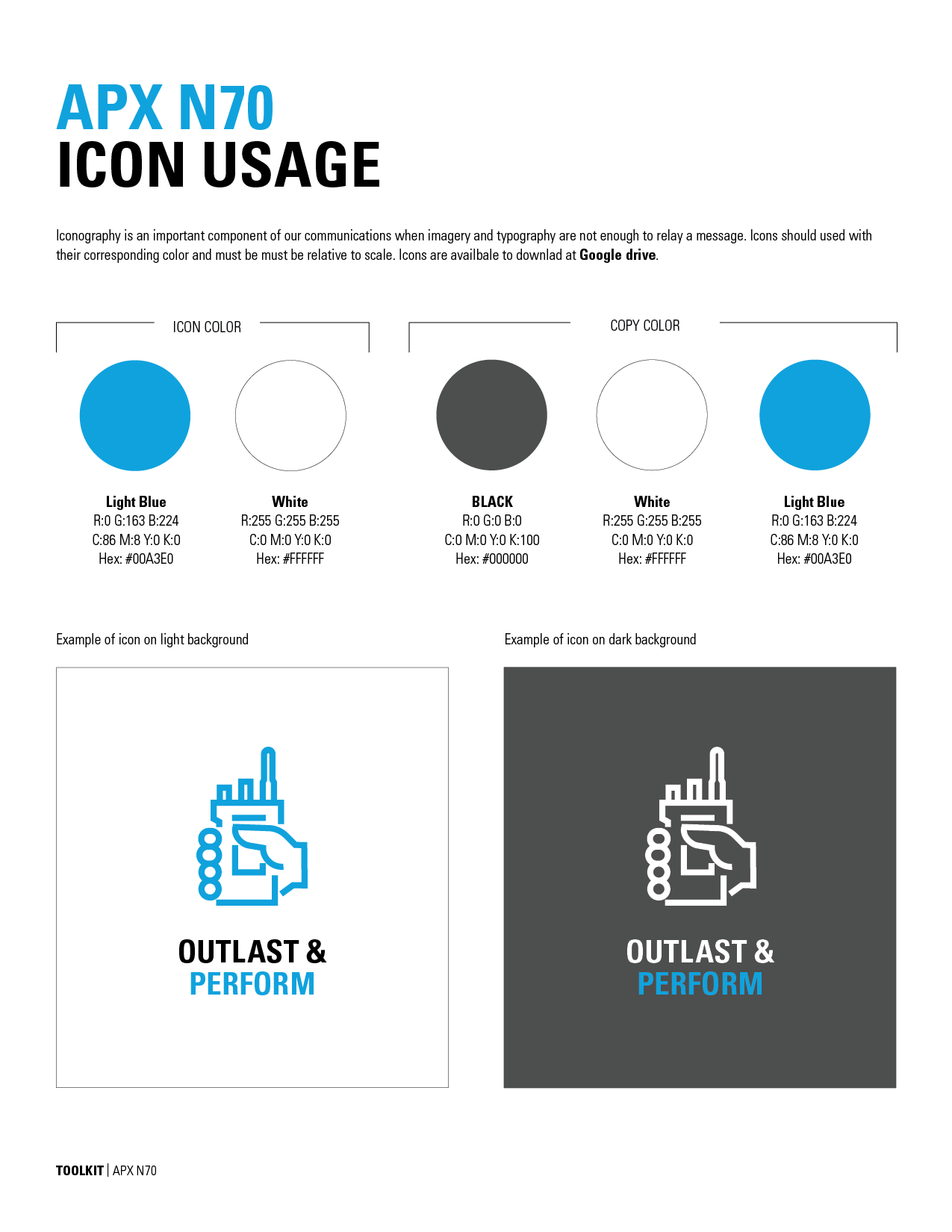
The visual language I crafted includes custom iconography tailored to each radio, capturing their unique features while aligning with the overarching design system. I also defined a versatile set of launch-specific colorways, developed to distinguish the products individually while maintaining a unified brand presence. One of the key graphic elements, the “X” motif, draws inspiration from the product design itself and serves as a visual anchor that connects the N-series as a cohesive family within the brand architecture.

In addition to the core visual elements, the toolkit includes extensive guidelines on typography, image selection and treatment, and texture elements—each chosen to enhance the tactile and technical nature of the products. These guidelines were created to be used across a wide range of applications, including printed collateral, website and e-commerce platforms, digital advertising, email marketing, and all social media channels.

The result is a highly adaptable, visually distinct brand system that not only supports the successful launch of the N70, N50, and N30 radios but also strengthens the brand’s presence in a competitive market. This project showcases my ability to build cohesive brand systems from the ground up—balancing strategic thinking with thoughtful visual design.

Video

I contributed to the creation of this video alongside many others, working collaboratively as part of a larger team effort. Please note that I do not own the rights to this video; all rights belong to their respective owners.

Rebrand 2024

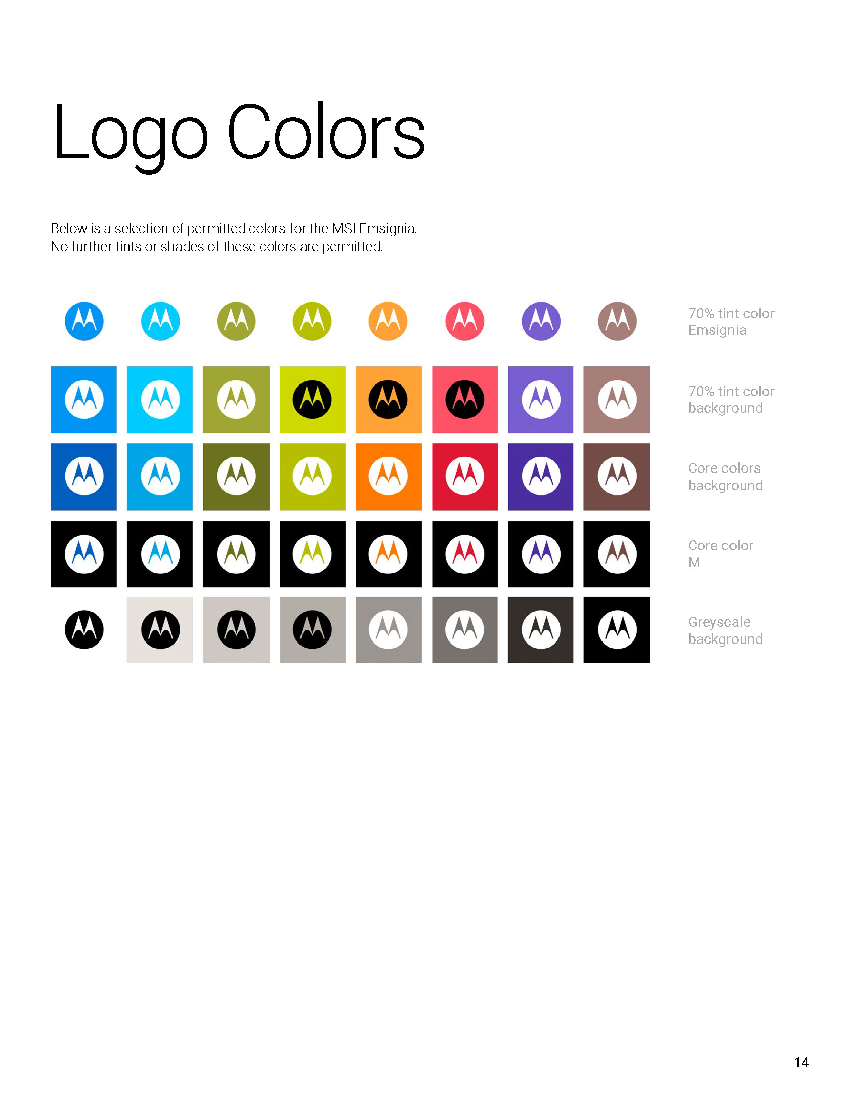
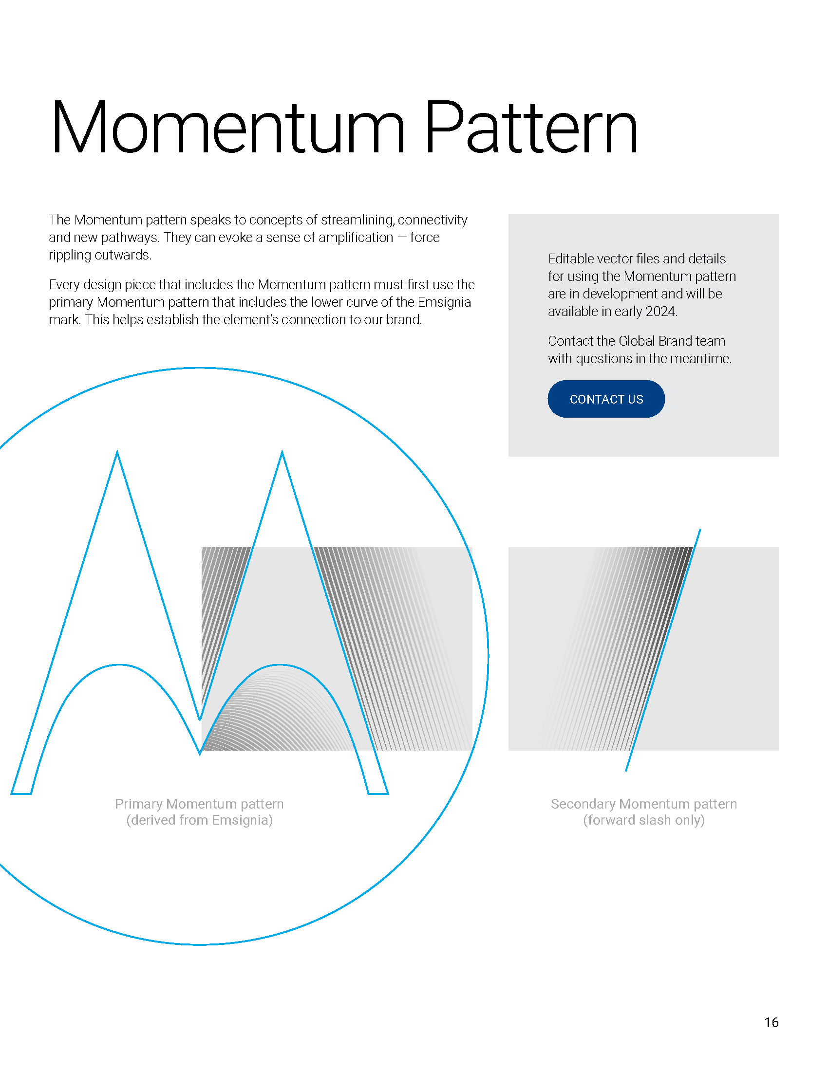
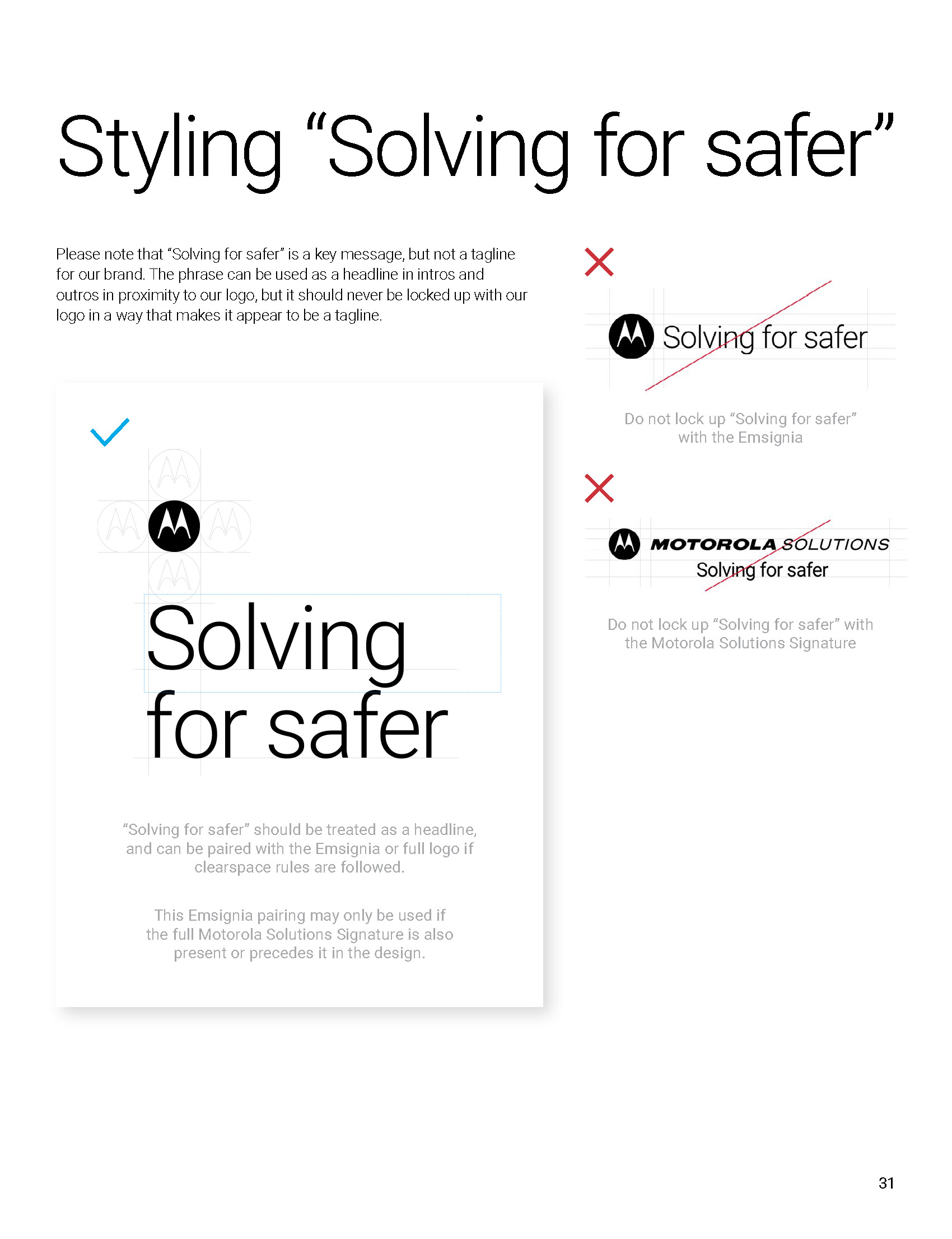
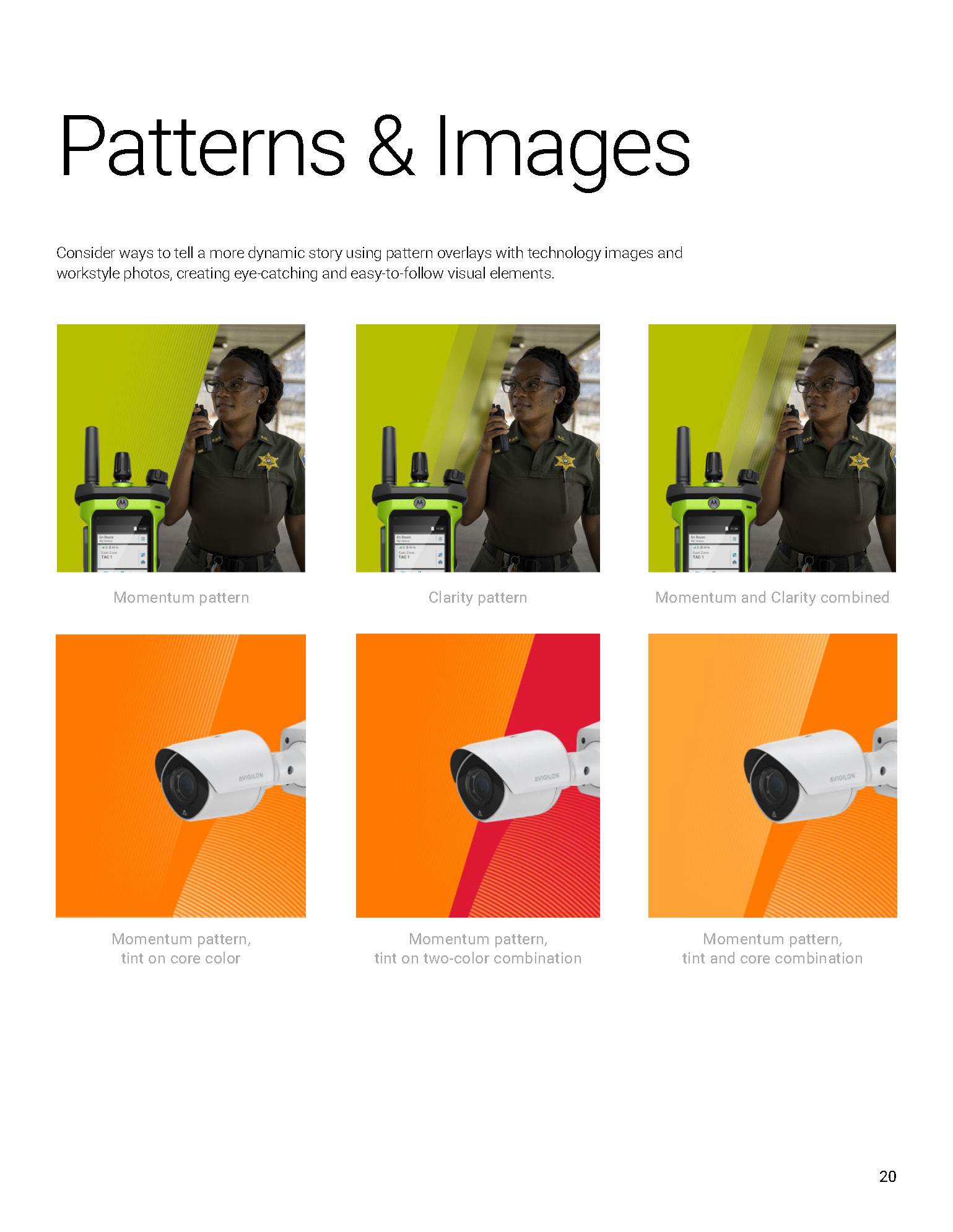
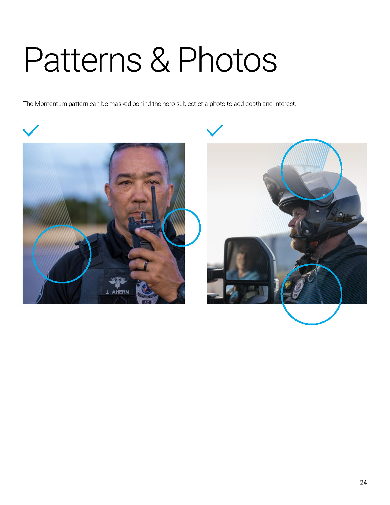
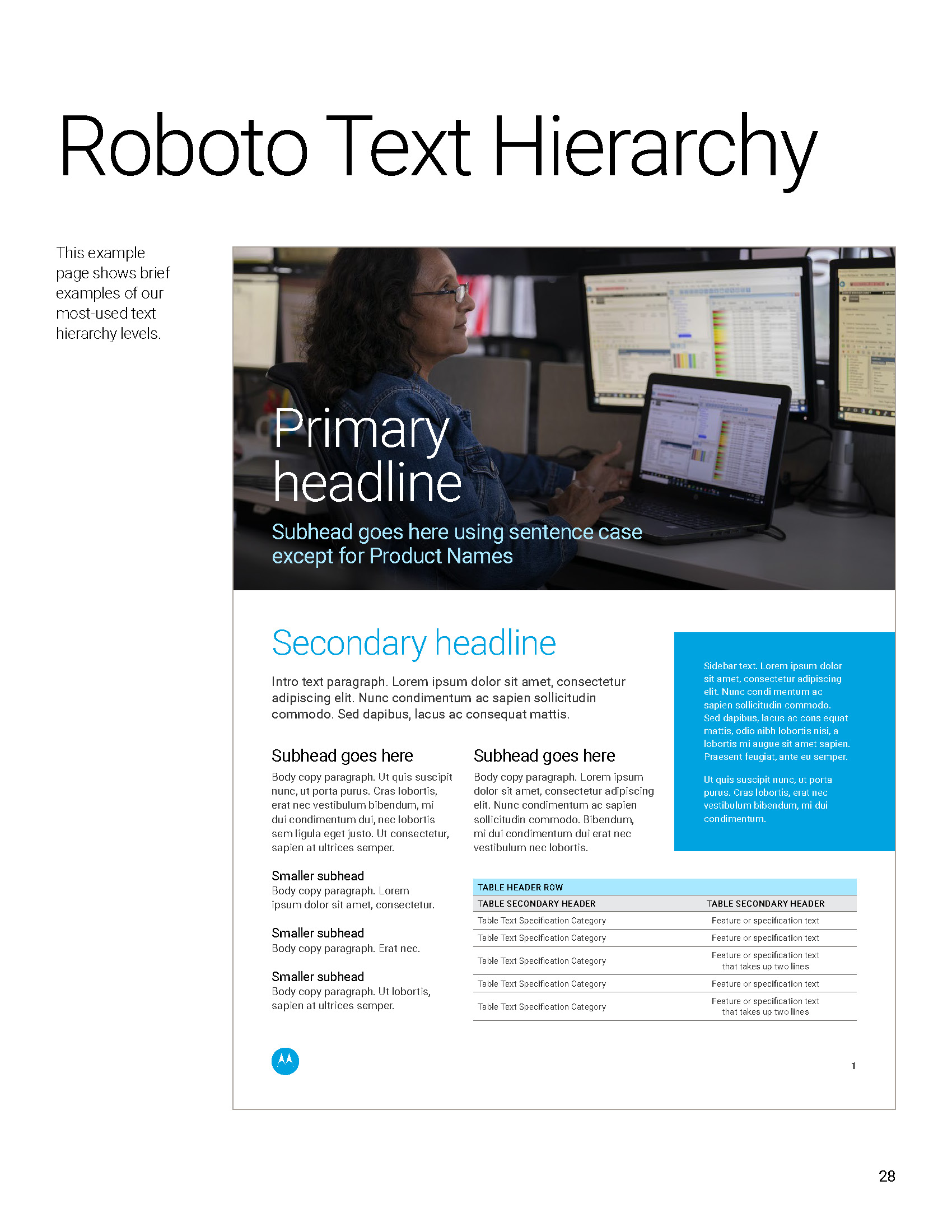
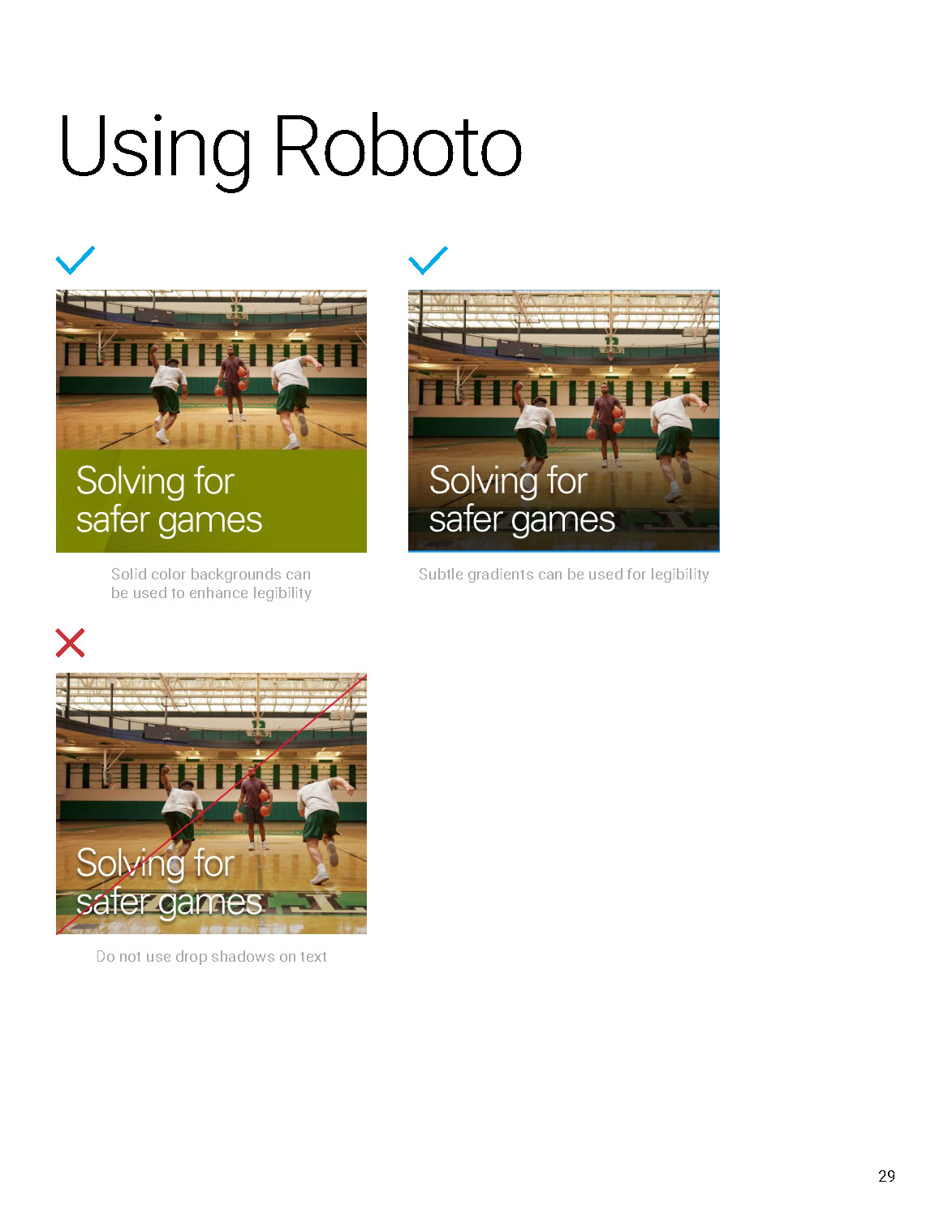
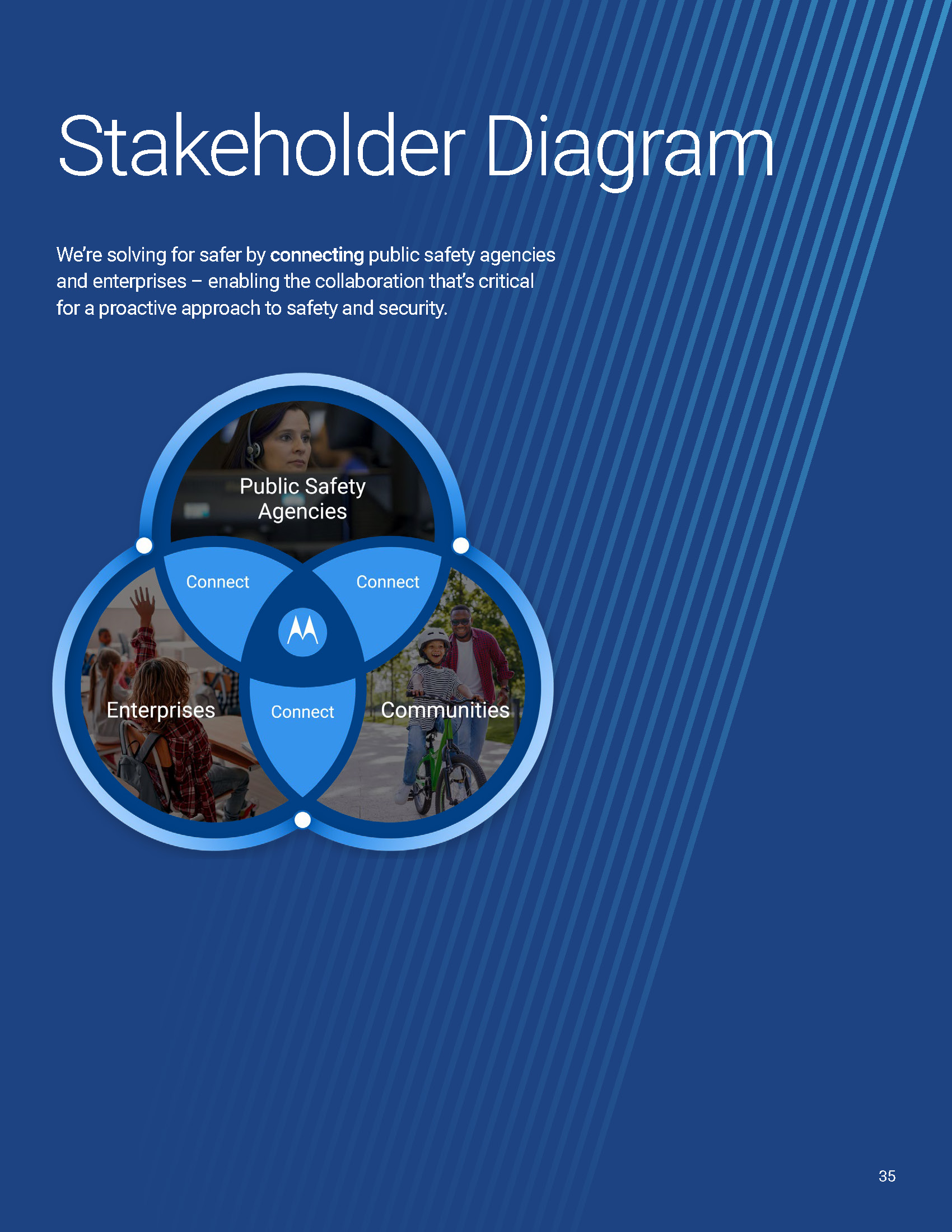
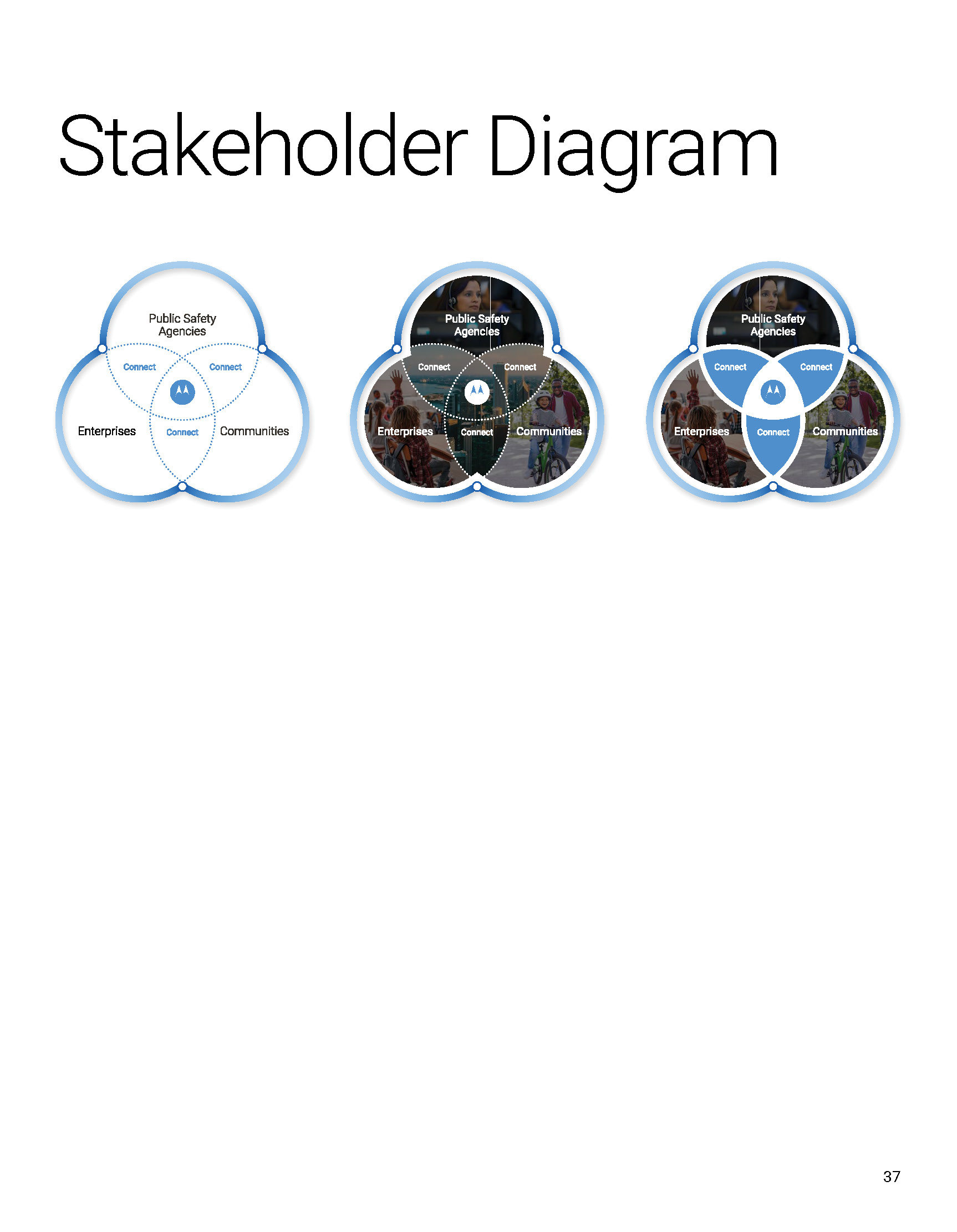
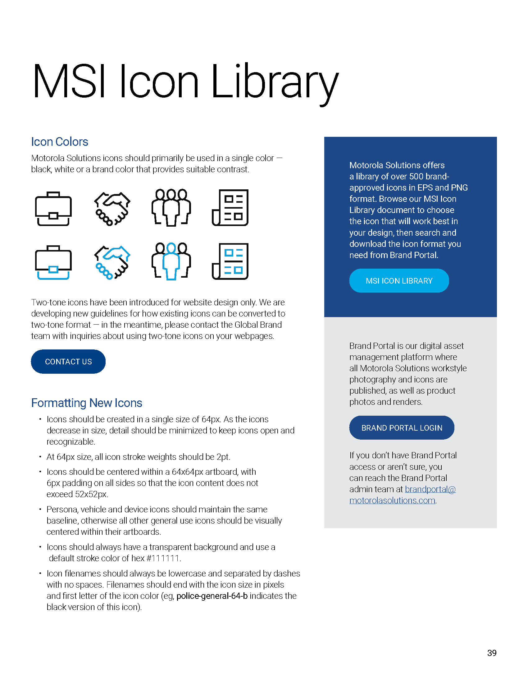
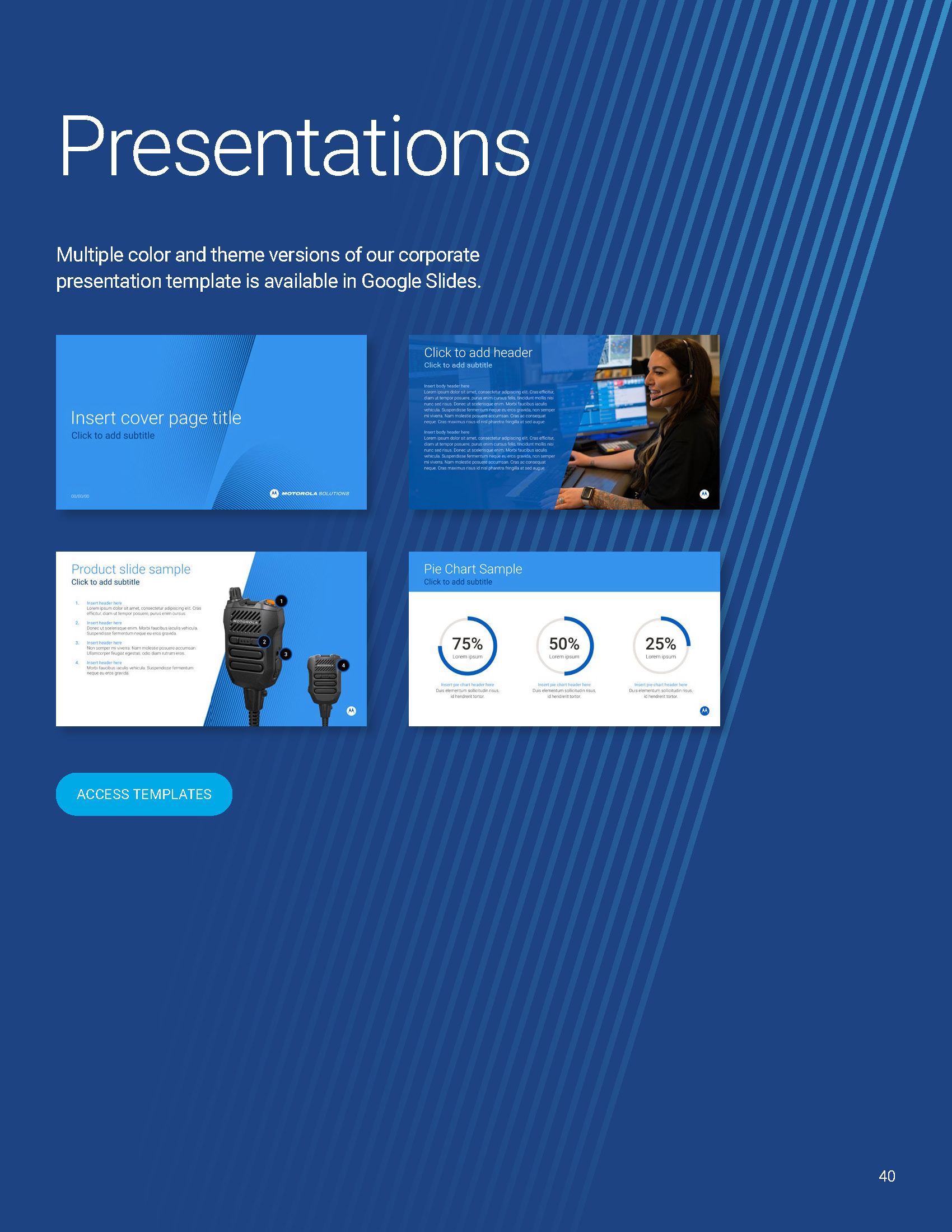
For the MSI rebrand launch at the end of 2024, I played a key role in both designing and leading a team of creatives to bring the refreshed brand to life. I helped shape the new visual direction by developing patterns, establishing a refined voice and tone, and creating a cohesive system of collateral, digital assets, and brand elements. From iconography, diagrams and image style to color treatments and print/digital materials, I guided the creative process to ensure consistency and impact across every touchpoint. By collaborating closely with the team, I ensured that the rebrand not only elevated MSI’s identity but also positioned it with a modern, unified look and feel that resonates with audiences.

The visual language I crafted includes custom iconography tailored to each radio, capturing their unique features while aligning with the overarching design system. I also defined a versatile set of launch-specific colorways, developed to distinguish the products individually while maintaining a unified brand presence. One of the key graphic elements, the “X” motif, draws inspiration from the product design itself and serves as a visual anchor that connects the N-series as a cohesive family within the brand architecture.

In addition to the core visual elements, the toolkit includes extensive guidelines on typography, image selection and treatment, and texture elements—each chosen to enhance the tactile and technical nature of the products. These guidelines were created to be used across a wide range of applications, including printed collateral, website and e-commerce platforms, digital advertising, email marketing, and all social media channels.

The result is a highly adaptable, visually distinct brand system that not only supports the successful launch of the N70, N50, and N30 radios but also strengthens the brand’s presence in a competitive market. This project showcases my ability to build cohesive brand systems from the ground up—balancing strategic thinking with thoughtful visual design.
Summit Annual Event

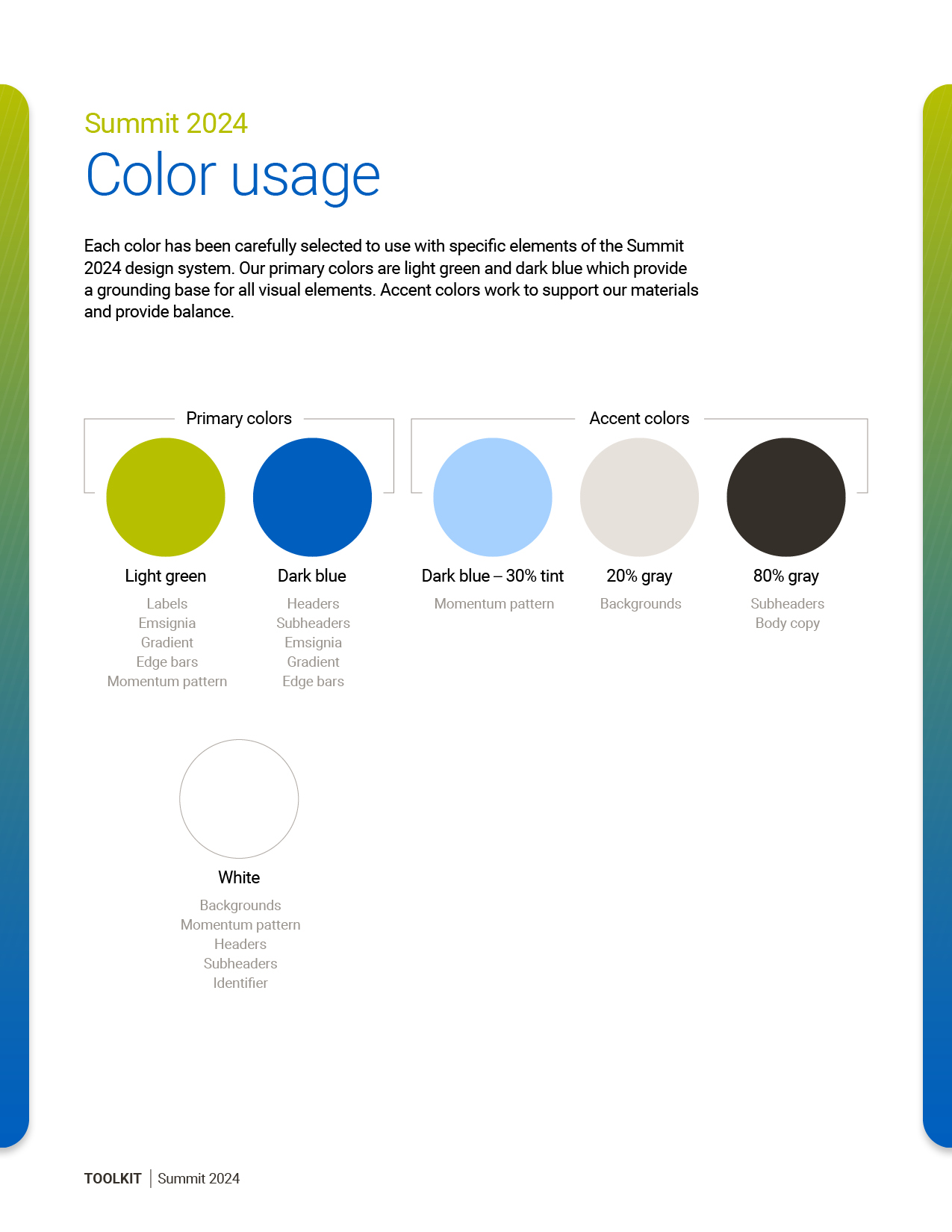
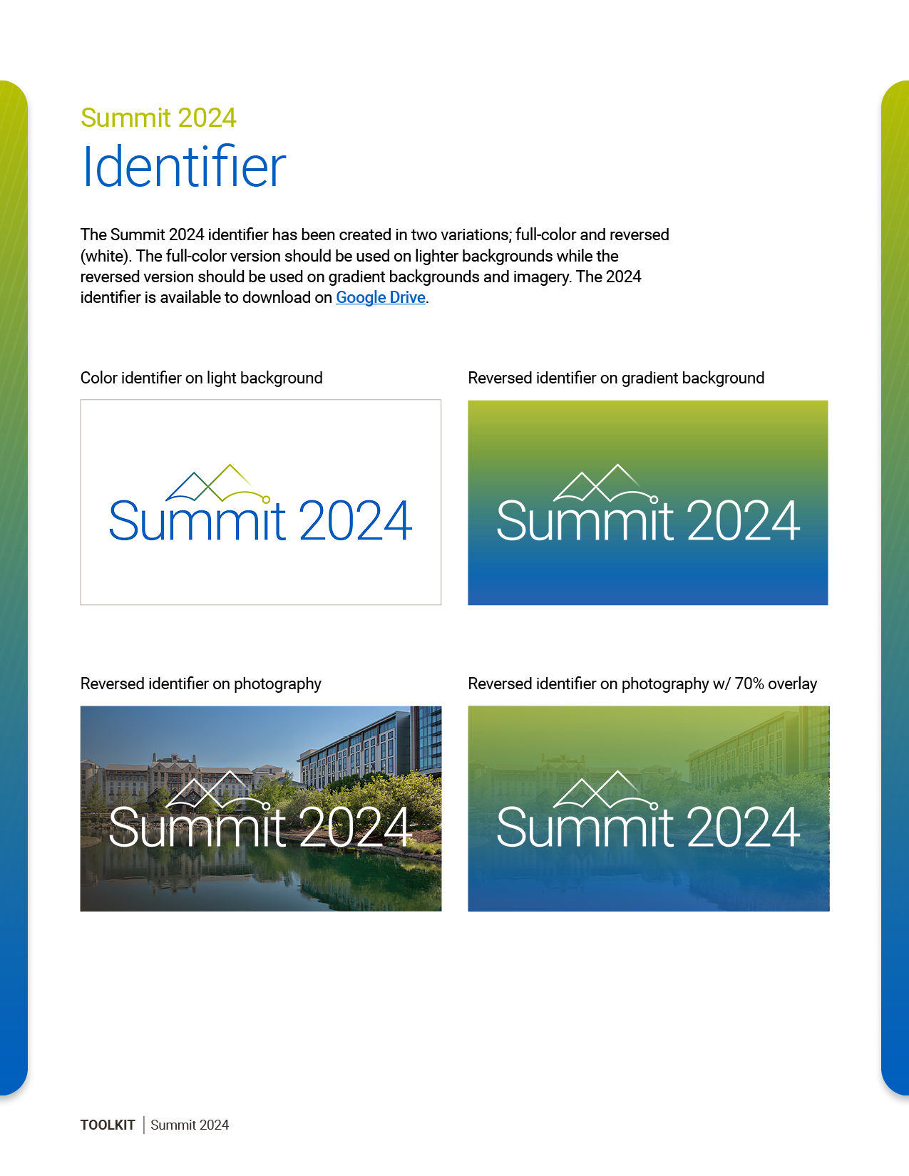
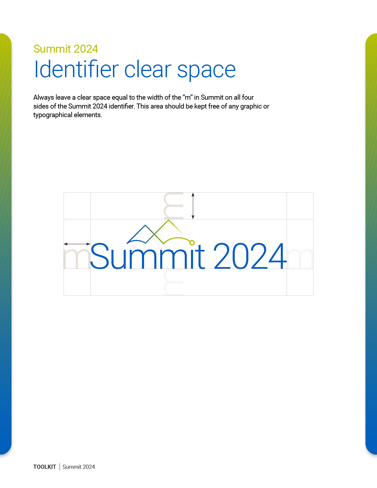
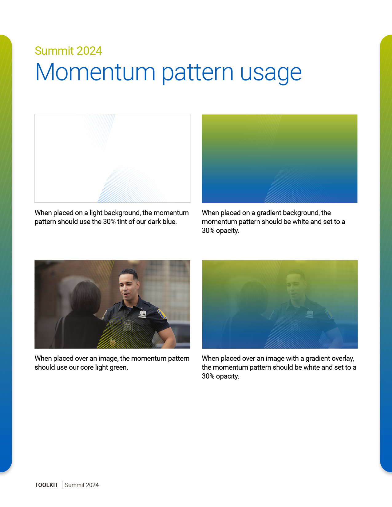
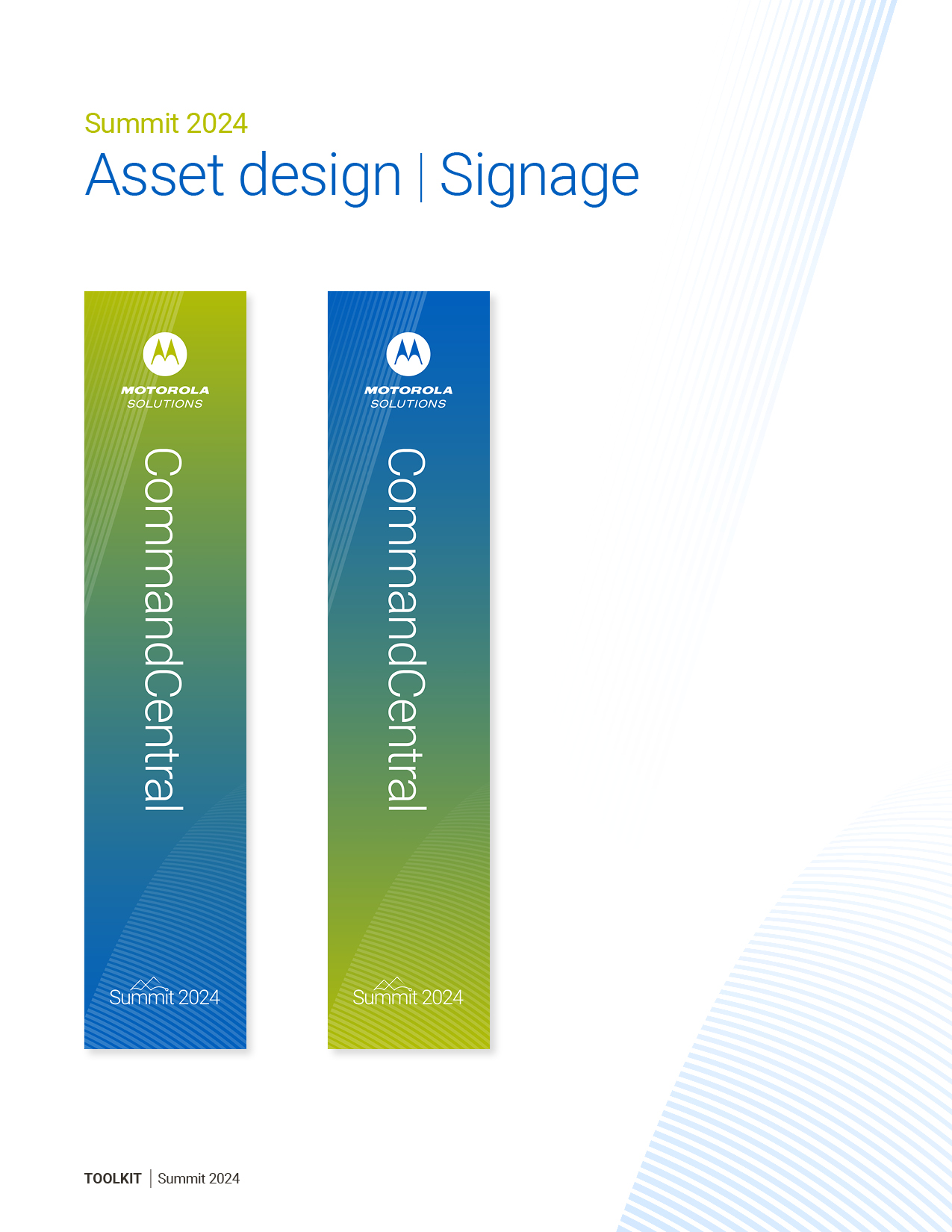
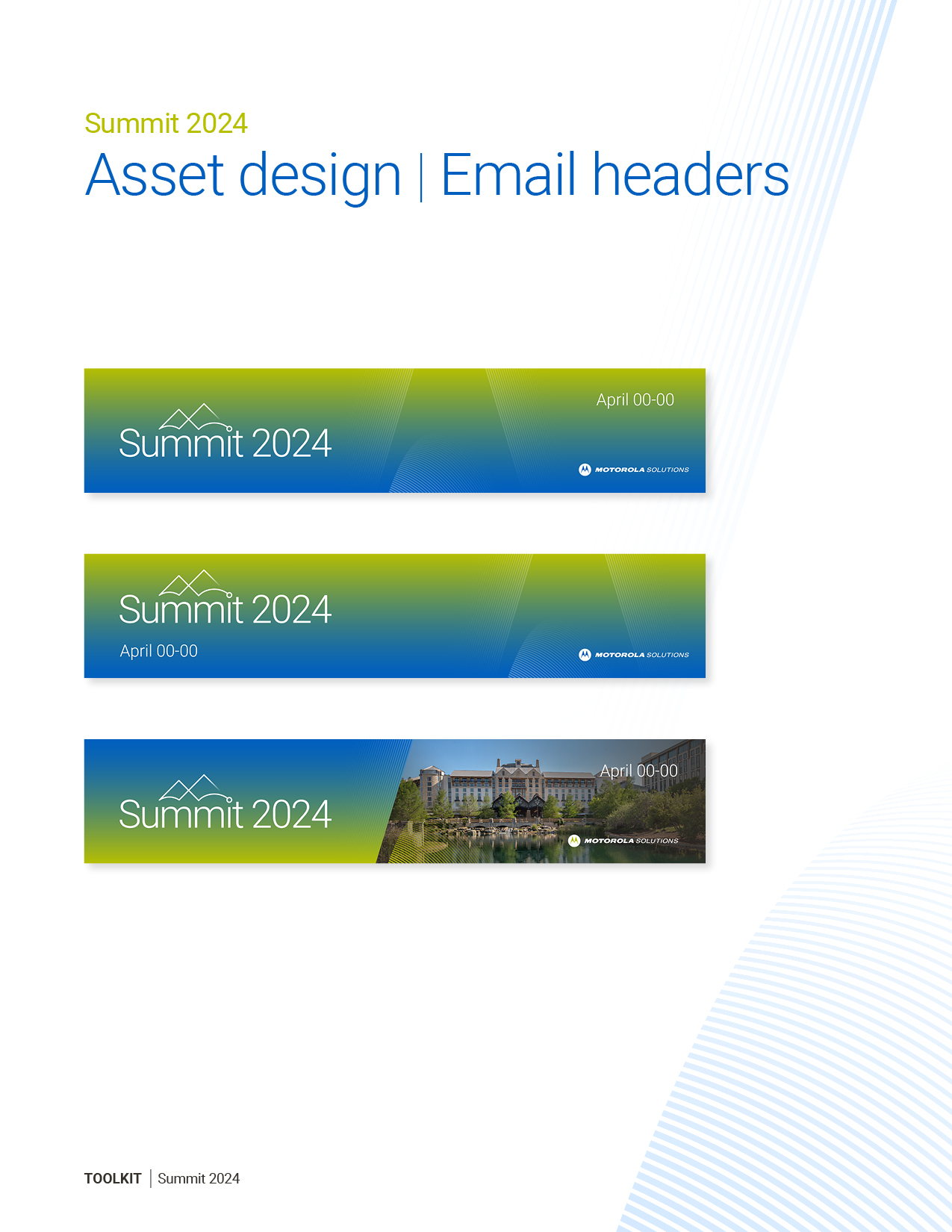
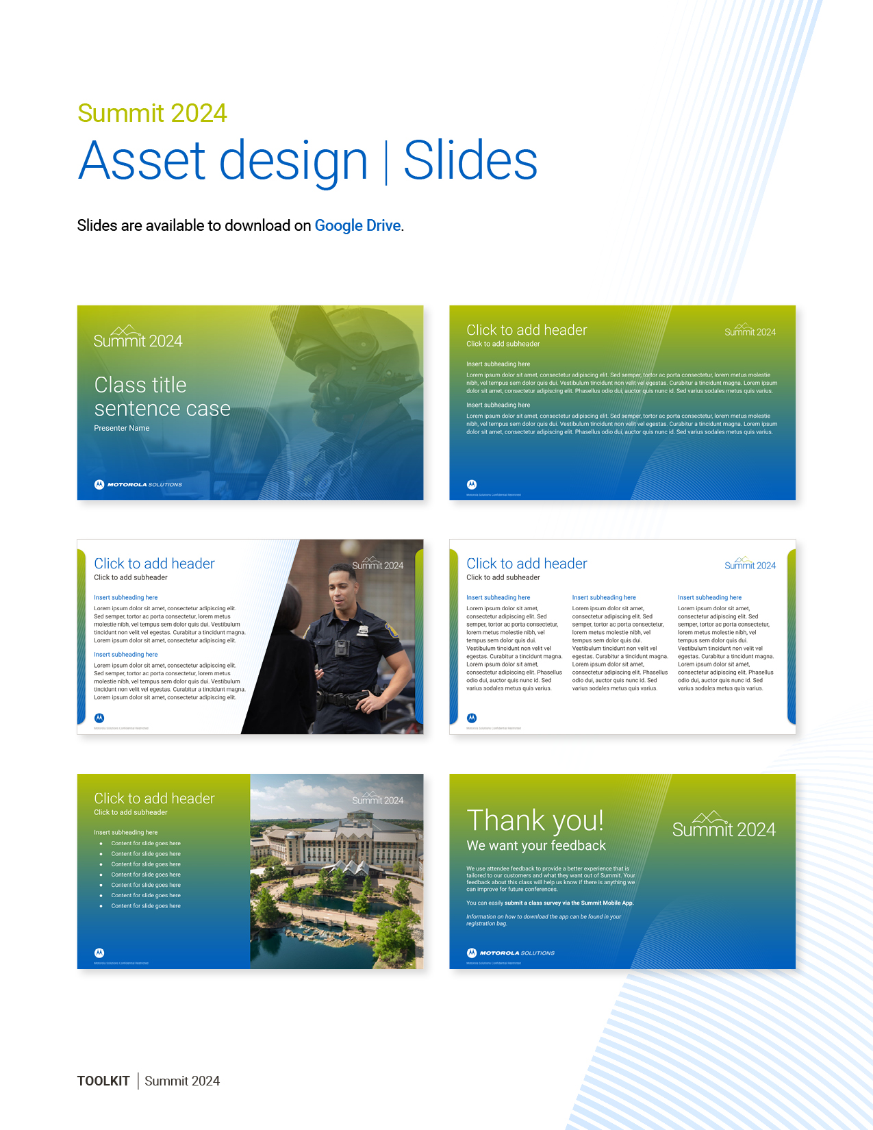
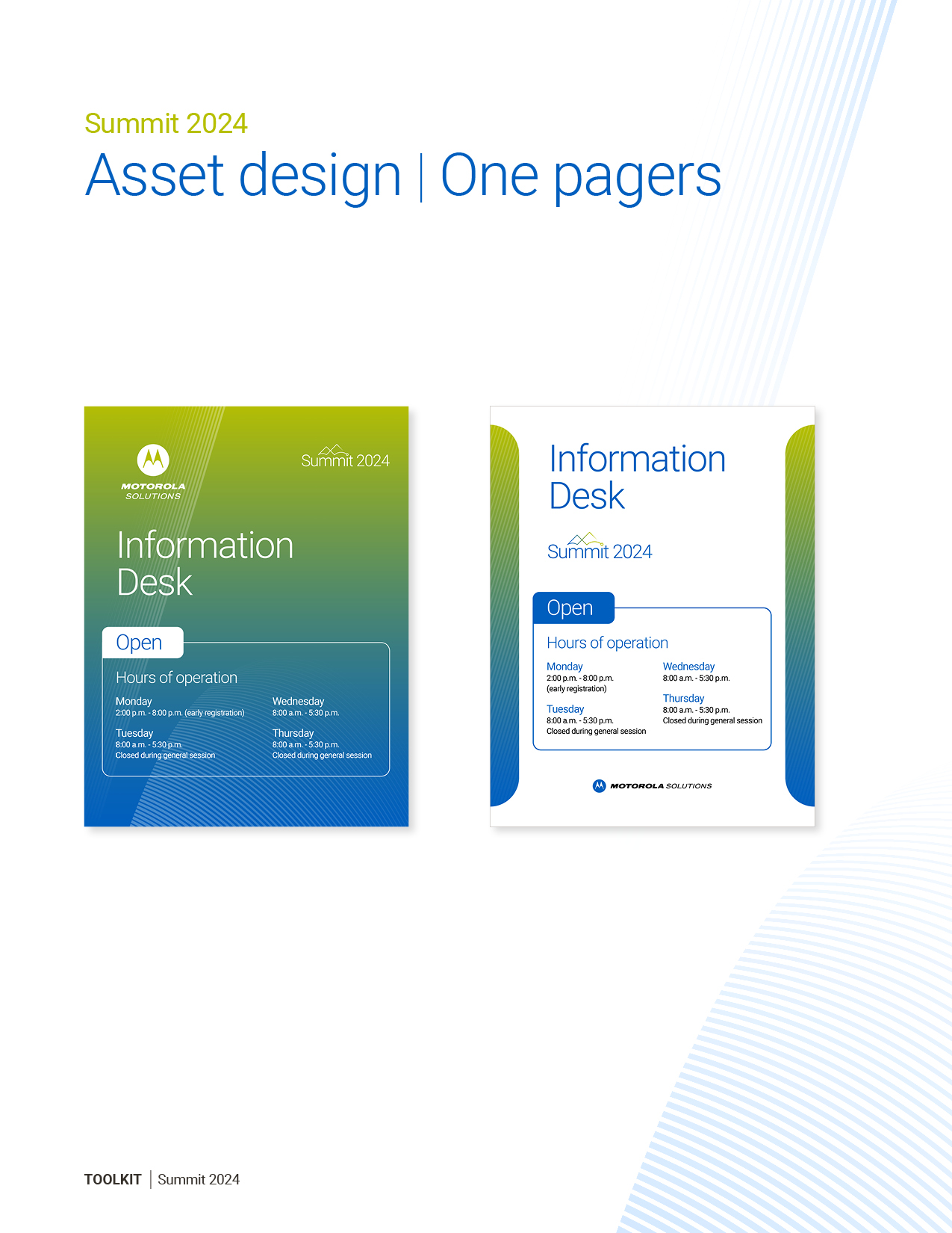
For Summit 2024, an annual flagship event hosted in a major city, I helped design and also led a team of designers in shaping the event’s visual identity and experience. Together, we developed the creative foundation through key identifiers and patterns, then extended that system across a wide range of assets including email headers, collateral print pieces, large-scale event signage, web landing pages, and digital presentation slides. By guiding the team’s creative direction while contributing hands-on design work, I ensured consistency across every touchpoint, resulting in a cohesive and engaging brand presence that elevated the event experience for attendees

Packaging Design

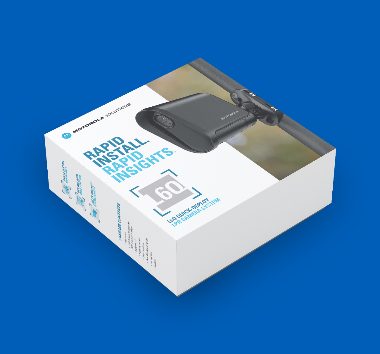
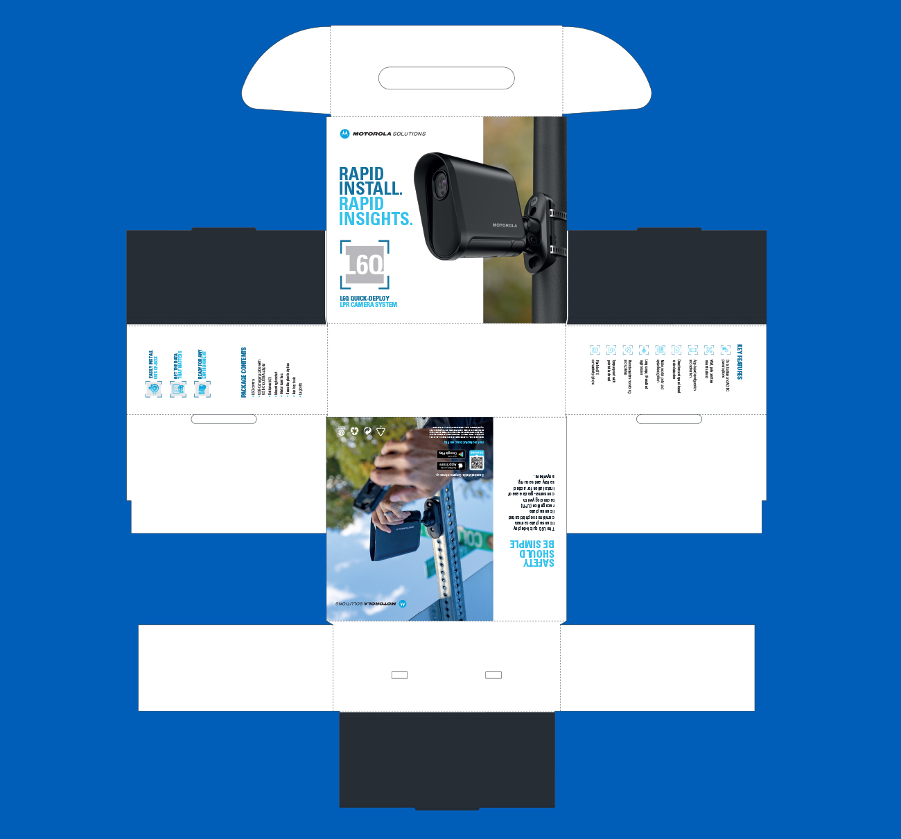
The L6Q camera project was a packaging design exploration that balanced sleek modern aesthetics with functional clarity. My focus was on creating a package that not only highlighted the camera’s advanced features but also conveyed a sense of innovation and premium quality. Through thoughtful use of typography, clean layouts, and strategic visual hierarchy, the design emphasized the product’s cutting-edge technology while remaining approachable to a wide audience. The result was a packaging concept that elevated the brand’s identity, strengthened shelf presence, and provided a visually engaging unboxing experience.

Visual Guide AI Technology

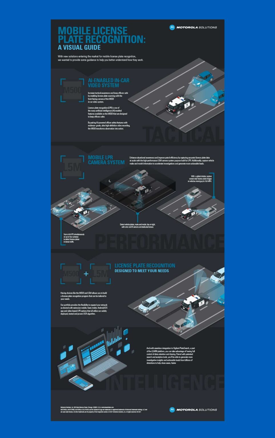
Together with a group of designers, I developed a visual guide that explains the functionality of AI-powered license plate recognition using isometric design. We translated complex technical workflows into clear, engaging visuals that show how the system captures, detects, and verifies license plate data in real time. Through collaborative brainstorming, clean layouts, and detailed isometric illustrations, our team created a guide that simplifies the technology for both technical and non-technical audiences, while also serving as a valuable tool for training, communication, and user adoption.
Global Facility Branding

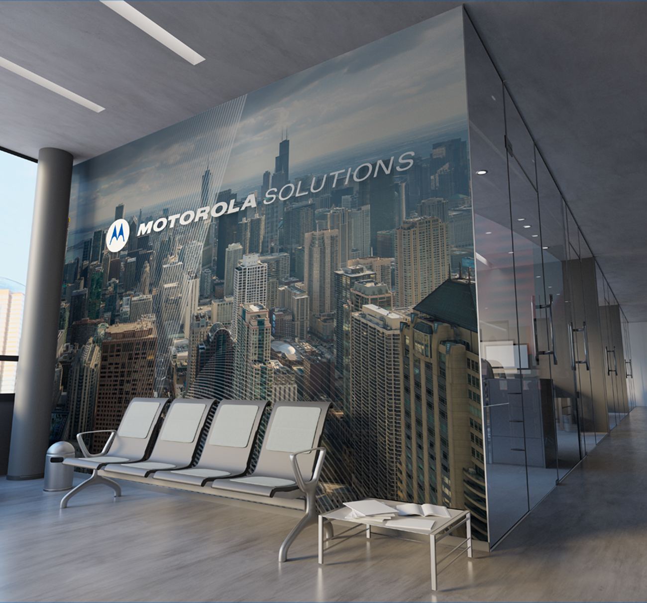
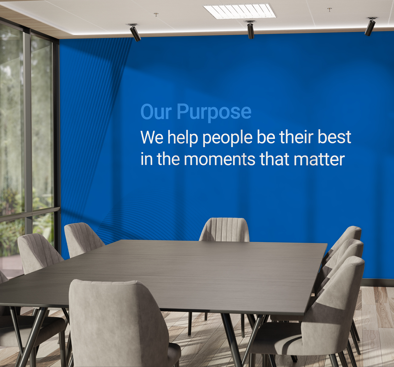
I led the design and implementation of facility branding across global Motorola Solutions locations, ensuring each space reflected the company’s brand identity and values consistently. This included creating signage, environmental graphics, and visual assets that enhanced employee experience and visitor engagement. Collaborating closely with cross-functional teams and international stakeholders, I developed design strategies that were adaptable to diverse cultural and physical environments while maintaining a cohesive global brand presence.